PIZZA TIME
Project CASE STUDY
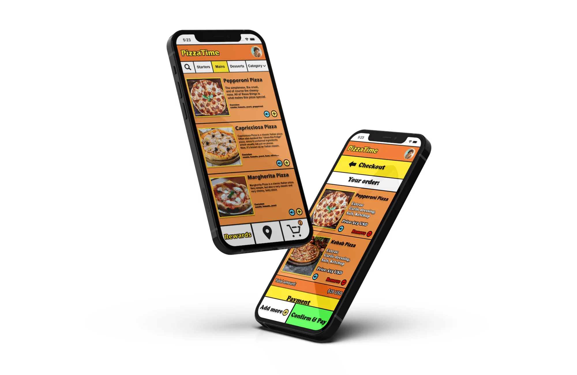
The Product
Is an app that lets users customize their order from a restaurant as well as complete their order.
Project duration
Two months in total
The Problem
Design a food order customization app for a fictional, modern restaurant.
The goal
The goal of the project was to go through an entire UX process of conducting user research as well as designing an app that is user friendly and needed on the market.
My Role
All UX Design roles in a product design process – this includes conducting UX Research as well as designing and testing.
Responsibilities
All UX Design roles in a product design process – this includes conducting UX Research as well as designing and testing.
User research: Summary
I conducted interviews of different age groups and created empathy maps to understand the users I’m designing for and their needs. The primary user group identified through the research conducted, ended up being adults with jobs who don’t have time to cook.
The group of users confirmed initial assumptions about food-ordering users. Research also revealed not only that time is a major factor when users decide to order from home, but ohter factors such as social difficulties and convenience also make the decision of users ordering from home.
The users pain points
Short of time
Adults with kids & jobs are often too busy to spend time cooking
Accessibility
Assistive technologies in food-ordering apps are rare to find
Credentials
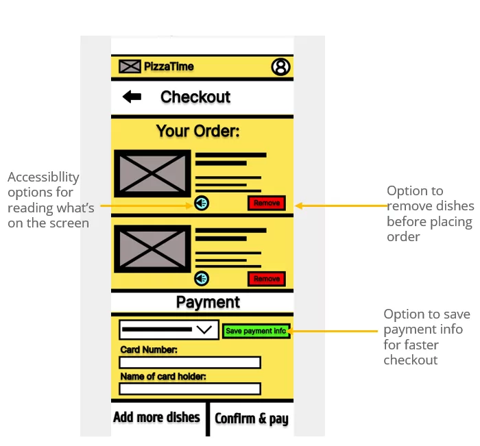
The option to save the users information (credentials like credit card info) are not often present in food-ordering apps for restaurants
Hard to read
Small text & images are not optimal for the readability of the user trying to read menu items, as well as too much showing at once on the screen
Persona: Alex
Problem statement:
Alex is a married teacher with a young child who needs more accessibility options when ordering food through an app because she has a vision impairment and doesn’t want to be late for work.
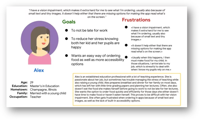
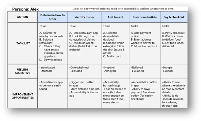
User journey map – Alex
The goal for Alex was to have an easy way of ordering food with accessibility options when short of time. In this journey map, we can see the steps in which she would take when ordering in an app and what can be improved upon.
The design
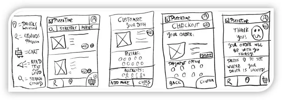
Paper wireframes
The thought process of the final paper wireframes were that it should be as few screens as possible for the main user flow to be completed, as well as there is enough relevant info on the screen at a time for the user experience to be optimal.
Digital Wireframes
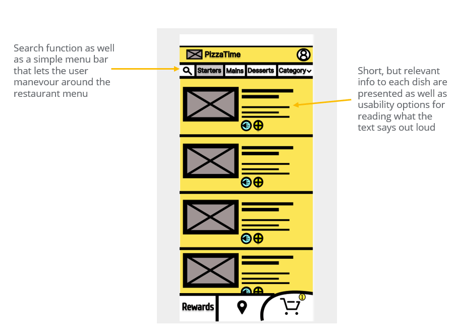
The overall goal and thought process of the design was to make it as easy as possible to get only relevant info over each dish before it’s picked. This makes the user experience good by not overwhelming the user with information (that they may not need) as well as make it easy to add to cart and manevour around the menu with it’s accessiblity and search options.
Design profile
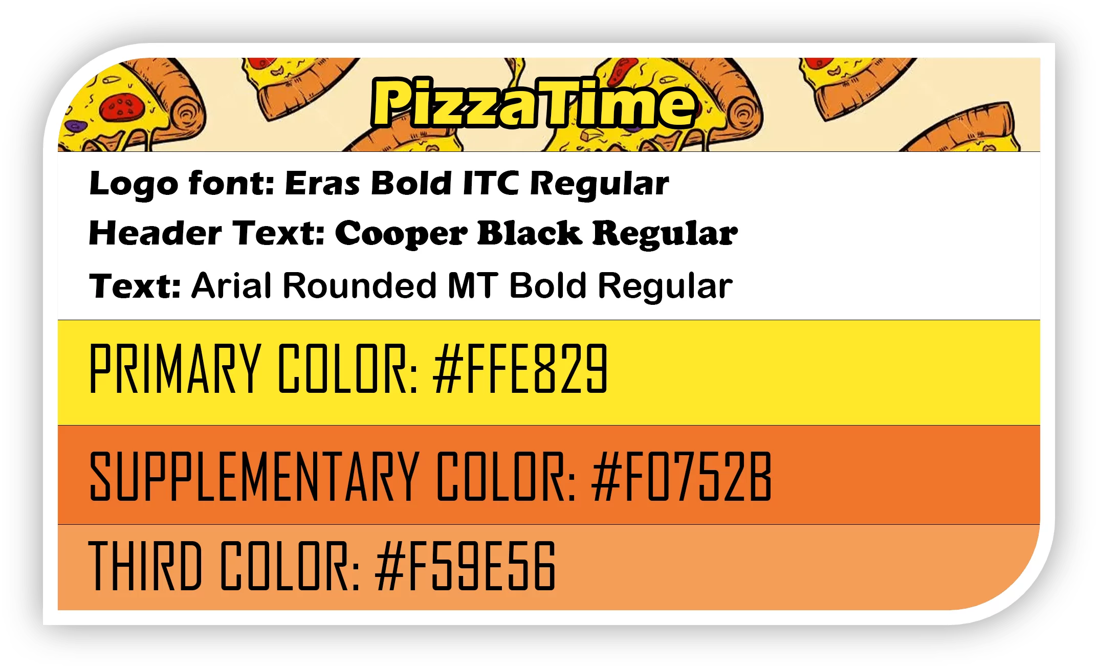
Before considering hi-fi mockups, tests were done to make sure certain color-combinations worked. This was done with accessiblity in mind. A design profile was made to ensure that the app has consistency in colors and fonts all through-out the app.
Usability study: findings
Round 1 Findings (Lo-fi prototype):
• Users would want to customize/add allergies to their order
• Layout can be improved upon, colors are not visually pleasing
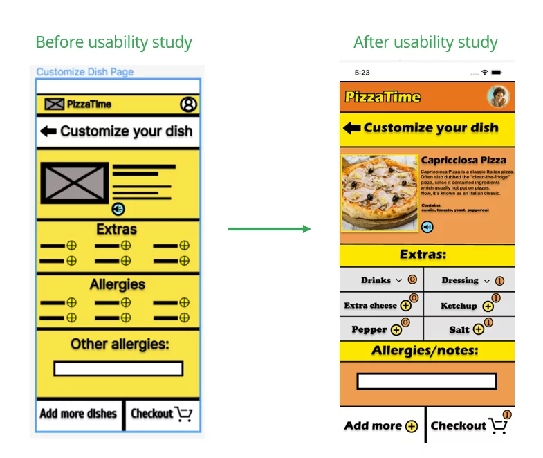
• It would be easier for users using the app by adding a counter to stuff added and selected to the cart
Round 2 Findings (HI-fi prototype):
• Not all users allergies or preferences can be listed, so adding a custom input method for the user to specify allergies themselves would be optimal
• Contrast/color is good
• Buttons can be better highlighted
Mockups
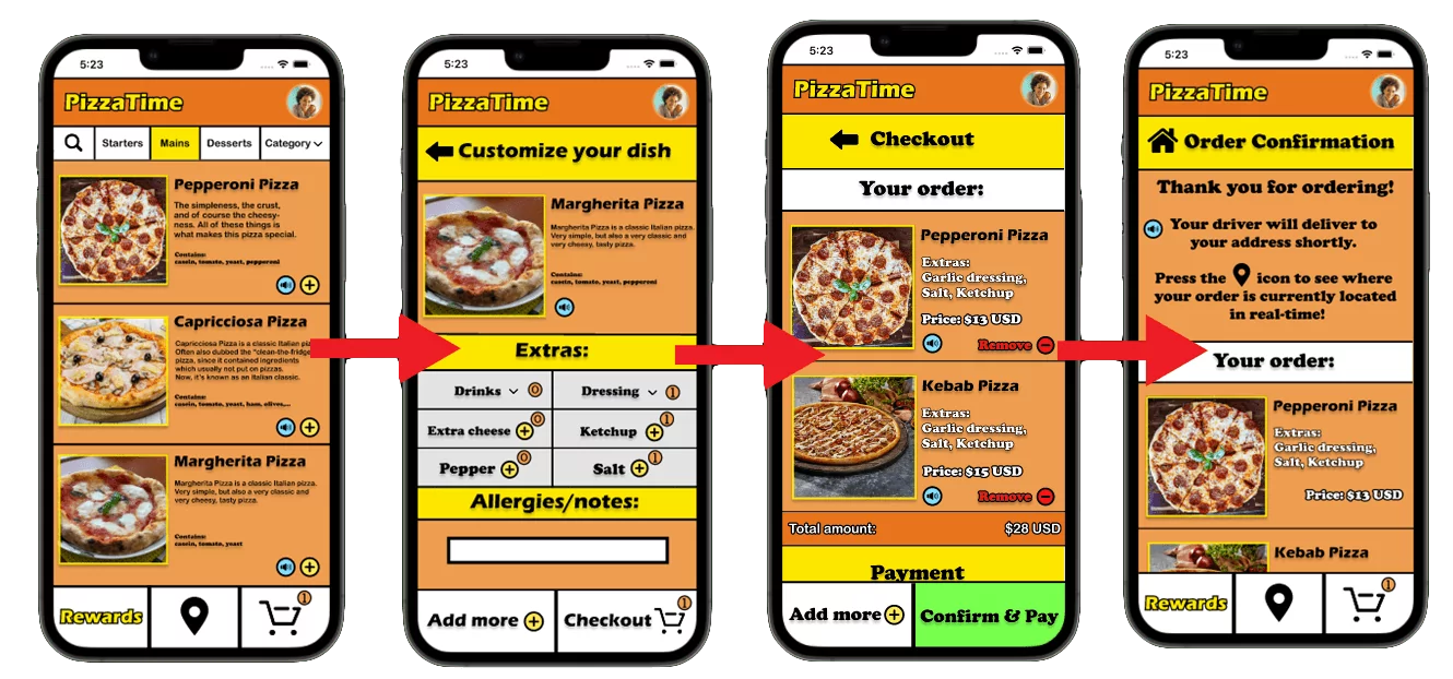
The usability study conducted made the inconveniences in the design easier to pin-point, and improvements where therefore made in the translation from the digital wireframes to hi-fi mockups. For example, counters were added to clearly indicate that some extras are selected.
Accessibility considerations
Scale
One major consideration during the design process was to make text and images big enough to be easily read. This also included well-thought out typography when choosing fonts and considering their readability. Icons were also used for a simpler UI and ease-of-use based on familiarity of well-known icons.
Text-to-speech
Another consideration was to have a button which (when clicked) has the app reading what the text on the screen says.
Contrast
The third major accessibilty consideration during the design was to make sure the contrast was good. This includes making sure the color-combinations work for specific color blindness and specific hard-to-see combinations of colors.
Takeaways
Impact
Since this was a fictional project and not a real app released, the only impact known was from the ones I conducted the usability studies on. At the last one, it seemed like they found the app extremely easy to learn and easy to use. One of them said: “I wish most ordering apps were like this”, which is a sign that the app would have a positive impact if released.
What I learned
What I learned from this project is what really goes into the entire UX-process and the considerations us as designers have to do when designing. The users are the most important, and user-centered design is key to good UX as well as good UI.
