BetterAid
Responsive Website & App UX Case Study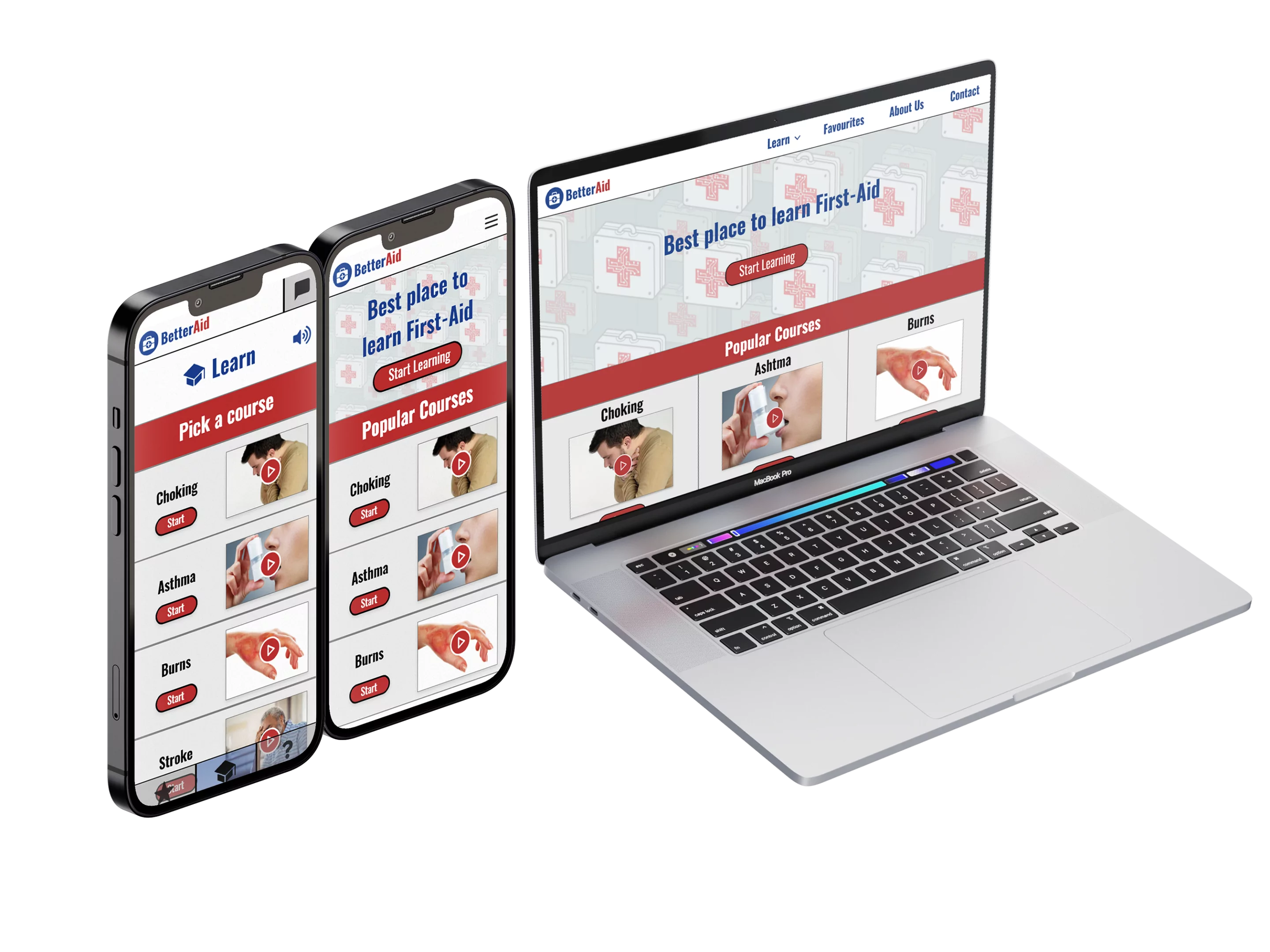
Project Overview
Project Duration
2 Months: July – September 2022
The Problem
Design a mobile app and a responsive website to help people learn First-Aid.
The Goal
Designing a mobile app and a responsive website for social good.
My Role
All UX Design Roles in a product design process.
Responsibilities
Empathizing, Research, Wireframing, & Prototyping.
Tools
Adobe XD
USER RESEARCH: Summary
The primary user group identified through the research conducted ended up being adults who need easy access to First-Aid learning. I performed usability tests on the target user group with 5 different websites & apps that offered to teach First-Aid.
These were some of the findings:
• 4 of 5 users found that it took too long to complete a First-Aid course.
• 3 of 5 users got confused over instructions.
• 1 of 5 users felt left out because of the lack of Accessibility options.
Research revealed that to make a First-Aid platform more user friendly, the users would need better accessibility options, clear instructions in different mediums as well as short, but concise courses.
During this process I created an empathy map to understand the user’s I’m designing for and their needs.
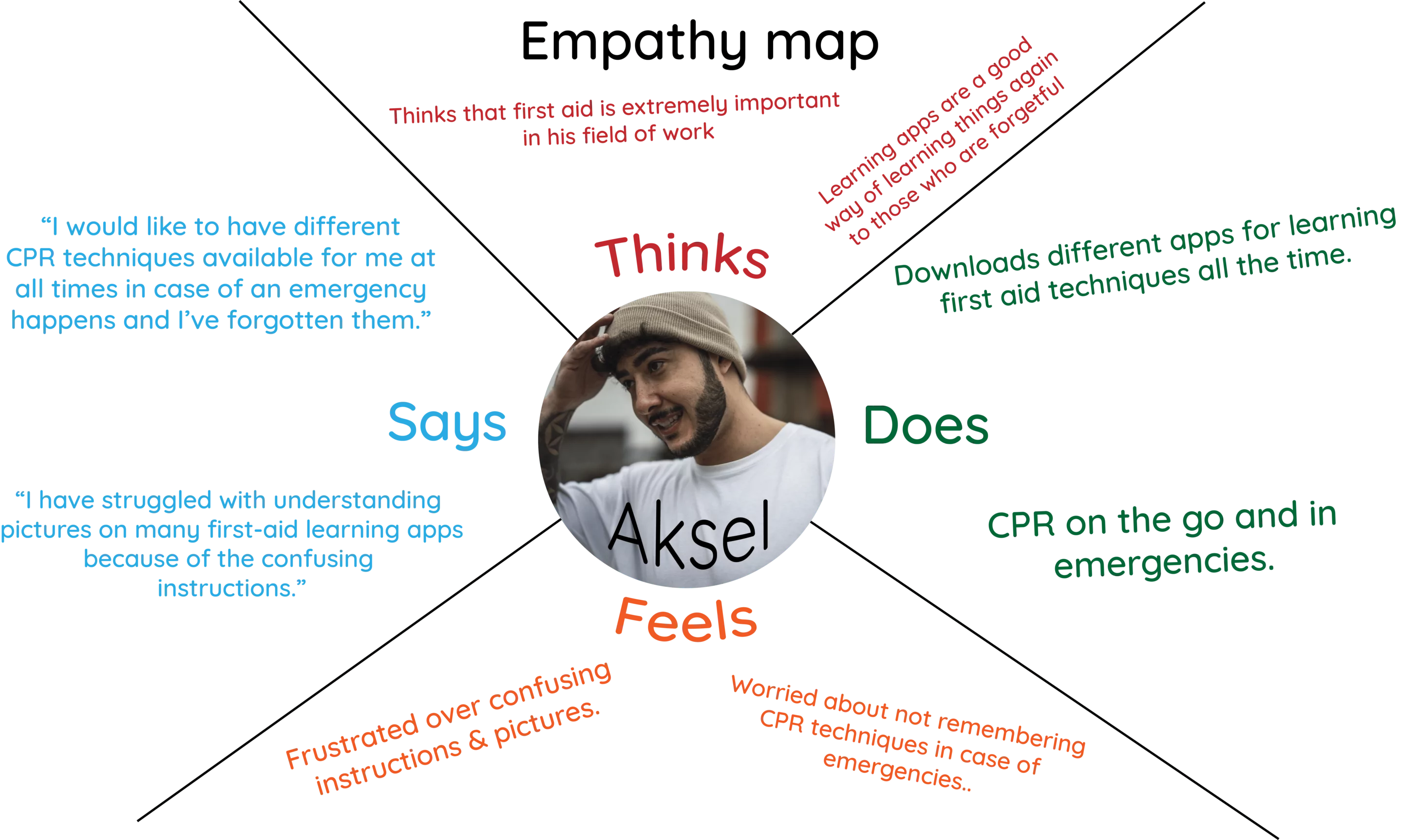
User Research Revealed Four Major Pain Points..
Time
Users that need to learn first-aid are often in dire situations and are short of time.
Quick-access
Users need a way of quickly accessing already-viewed courses in-case they need to view them again in dire situations.
Confusing instructions
Users that are short of time also need clear instructions, especially in dire situations.
Contrast & accessibility
Users need text & color combinations that aren’t hard to read. Many first-aid platforms seem to not match WCAG (Web Content Accessibility Guidelines.)
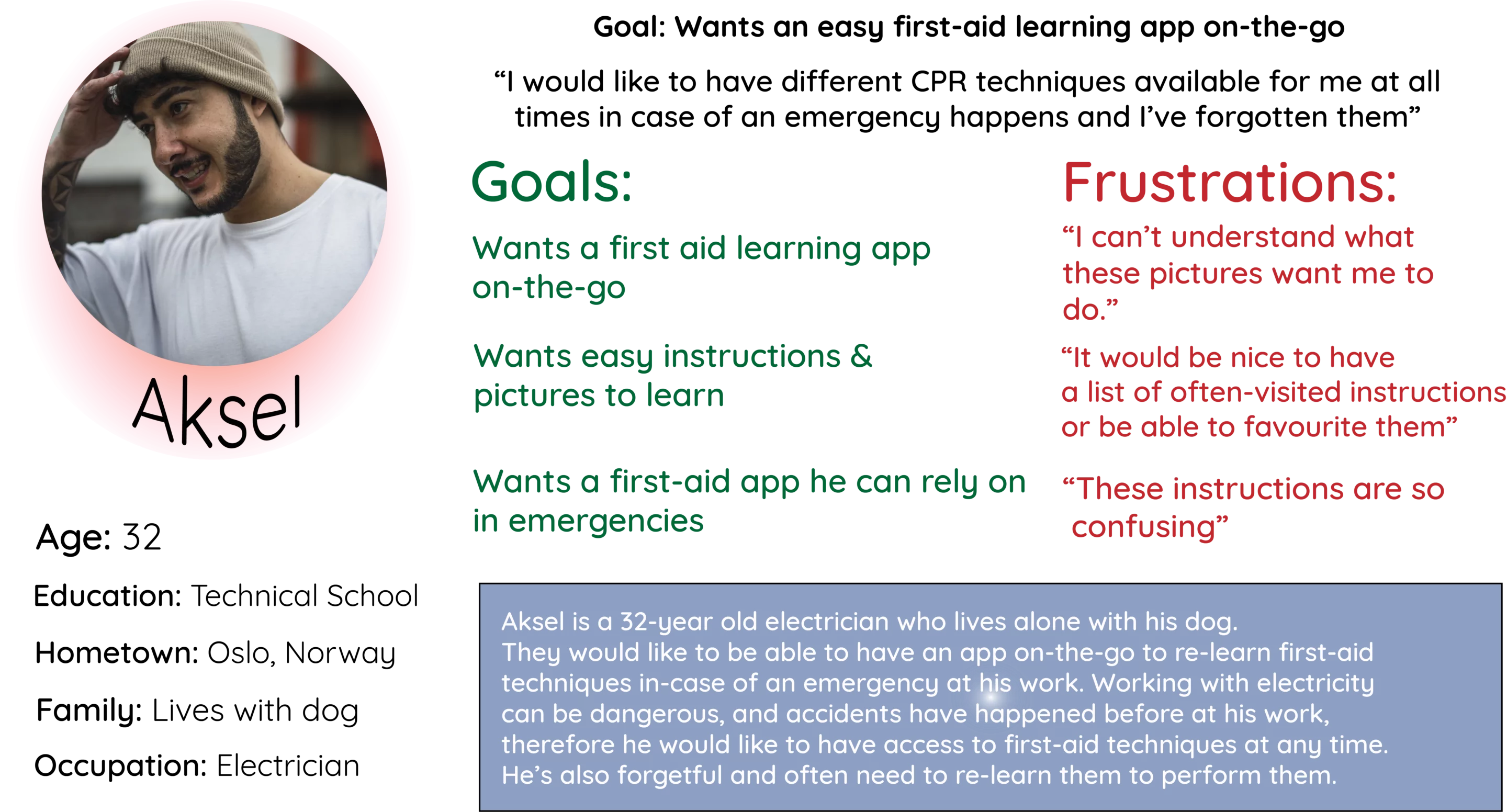
Persona: Aksel
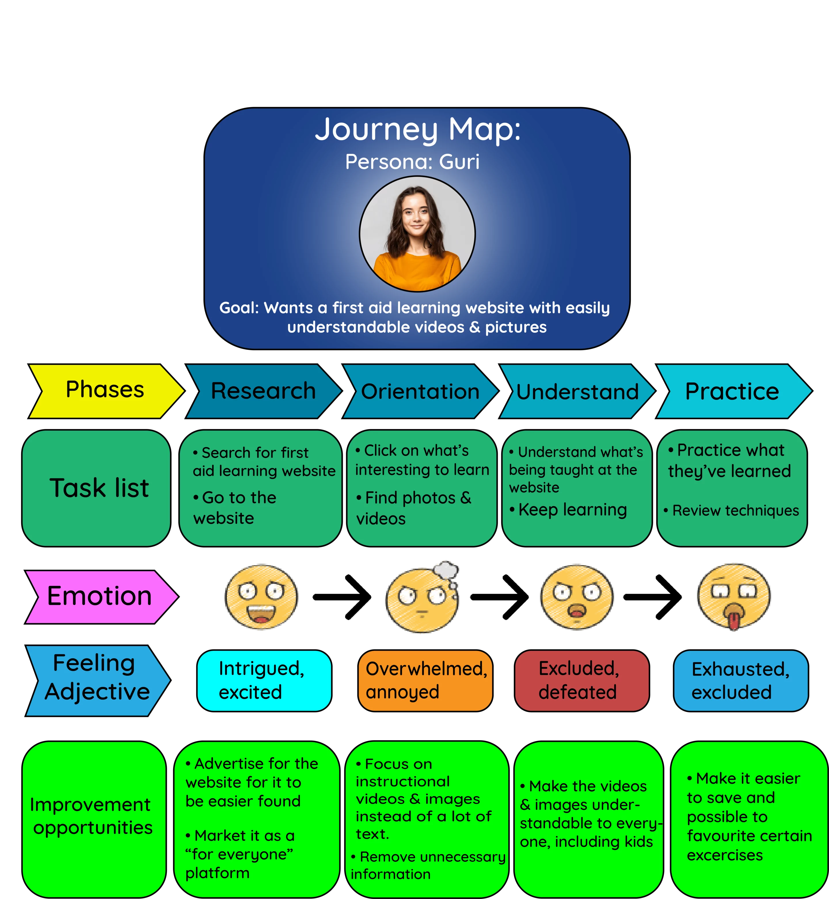
Persona: Guri
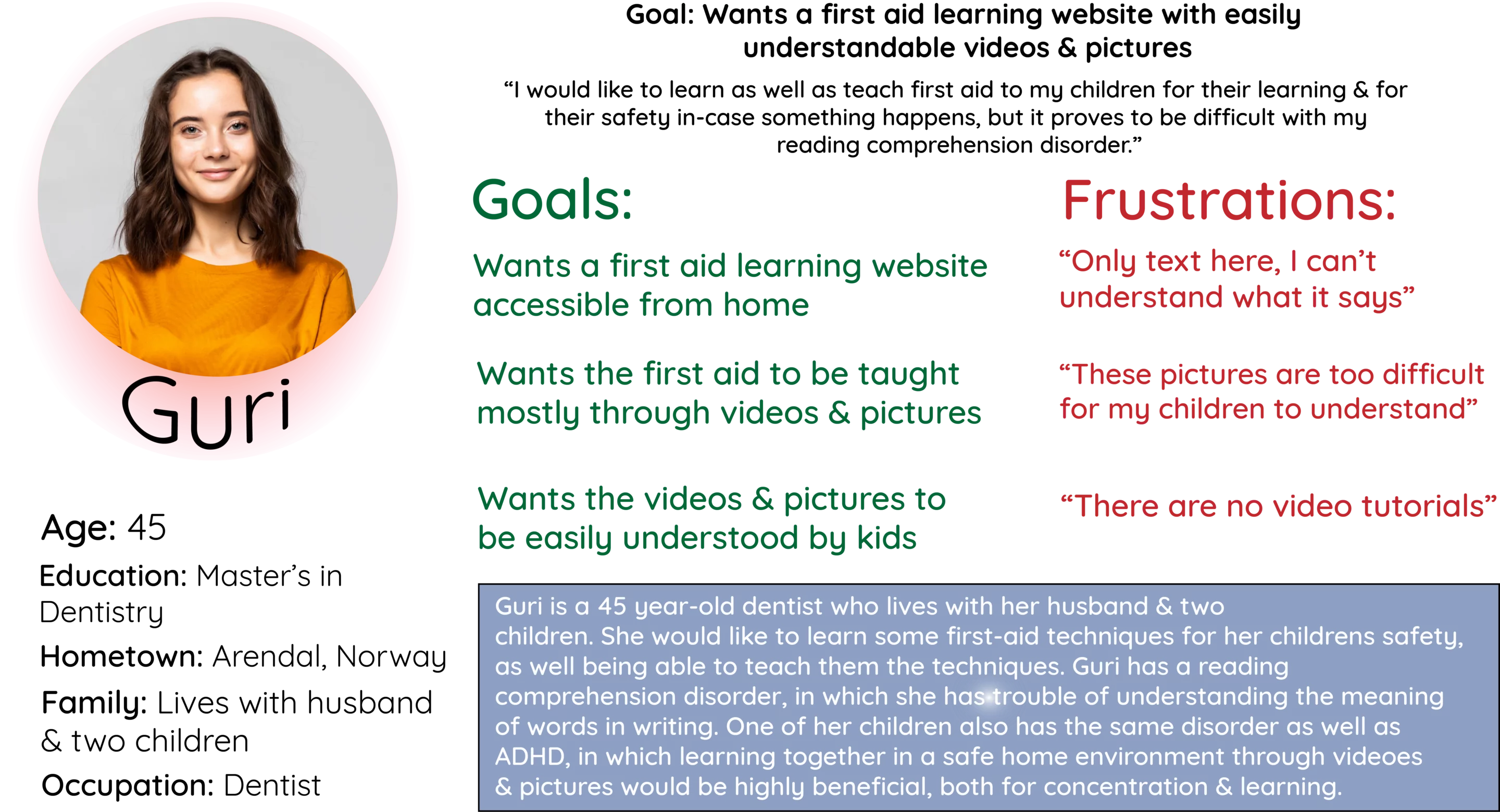
PROBLEM STATEMENT:
“Guri is a dentist with children who needs a first-aid learning platform with easily understandable videos & pictures because of her reading comprehension disorder in order to learn first-aid for her children’s safety.”
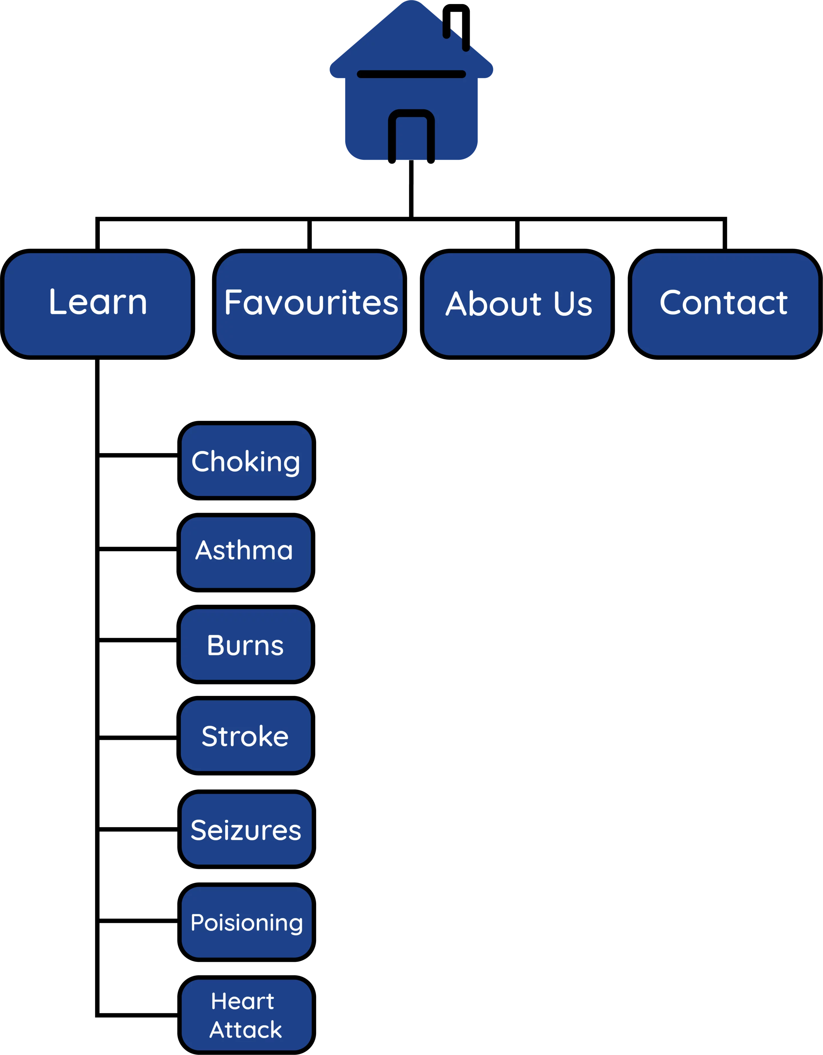
Site Map
Starting the design of a website with creating a sitemap is effective in order to get an overview over the website’s navigation and the relationship the pages have to each other.
The sitemap of the fictional ‘BetterAid’ was designed with the thought of users having as few screens as possible to click through when completing the main user flow.
This was also important because of the users identified had to have access to courses quick & easy in dire situations.
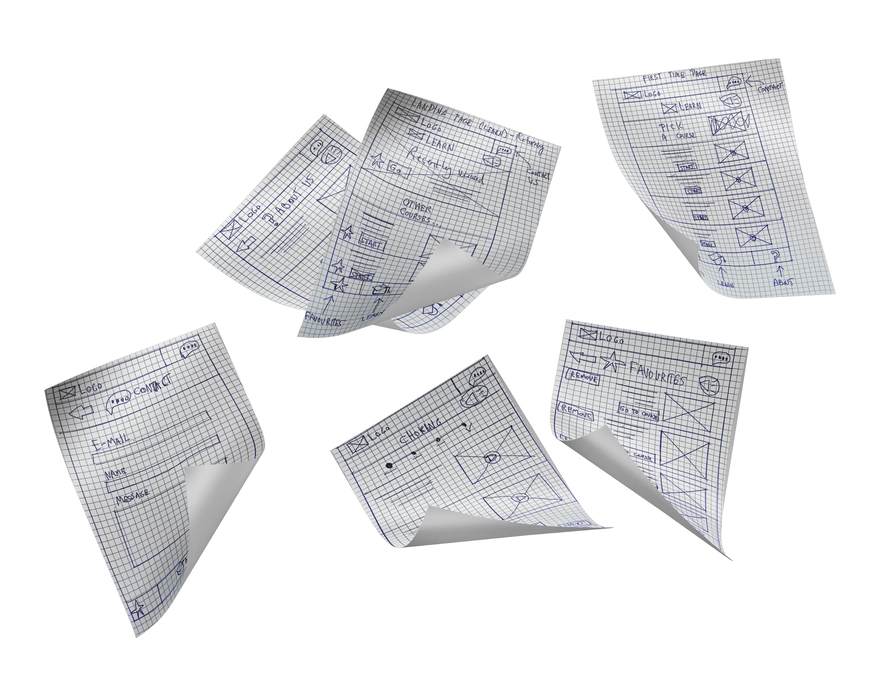
Paper Wireframes
DIGITAL WIREFRAMES
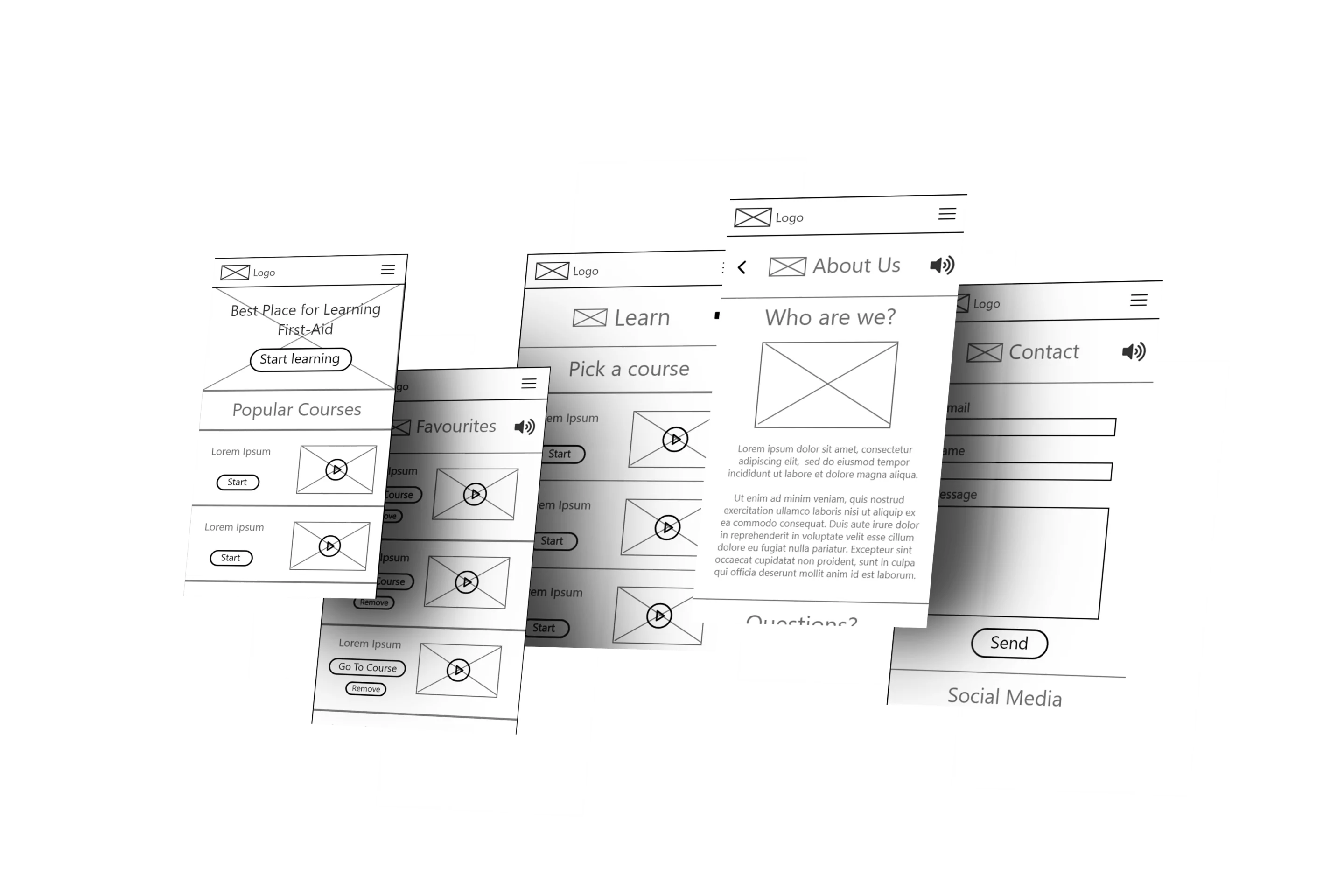
Lo-Fi Prototype
(Made with adobe XD)
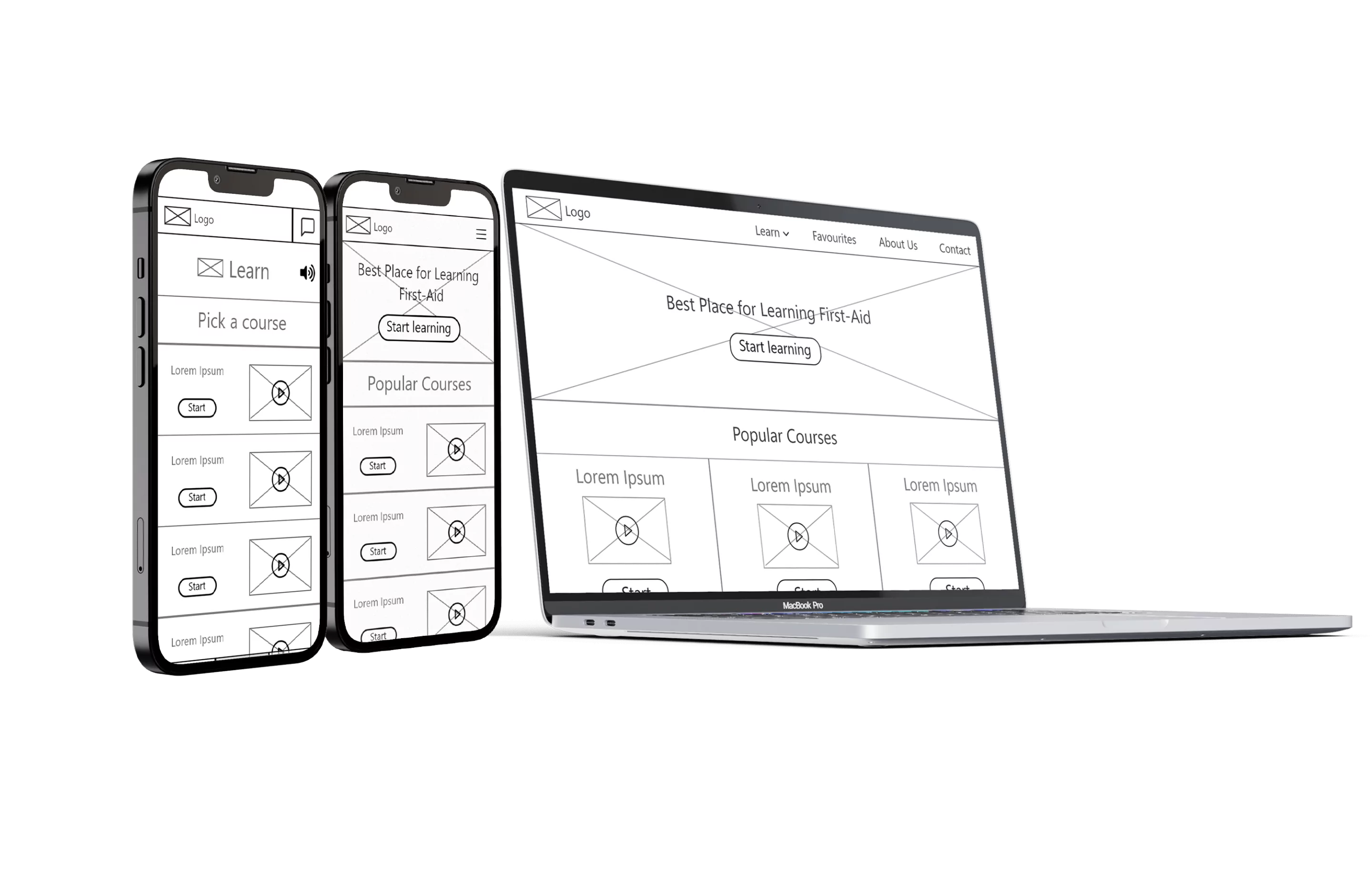
With accessibility in-mind
When designing the mockups, accessibility was a big priority. These were some of the measures taken for better accessibility:
1. Contrast. Checked that all the colors used had a good contrast that matched Web-Content Accessibility Guidelines (AA+).
2. Created a button that reads all text on screen when pressed.
3. Difficult language. Made sure all text was easy to understand & didn’t use too difficult language or long text segments.
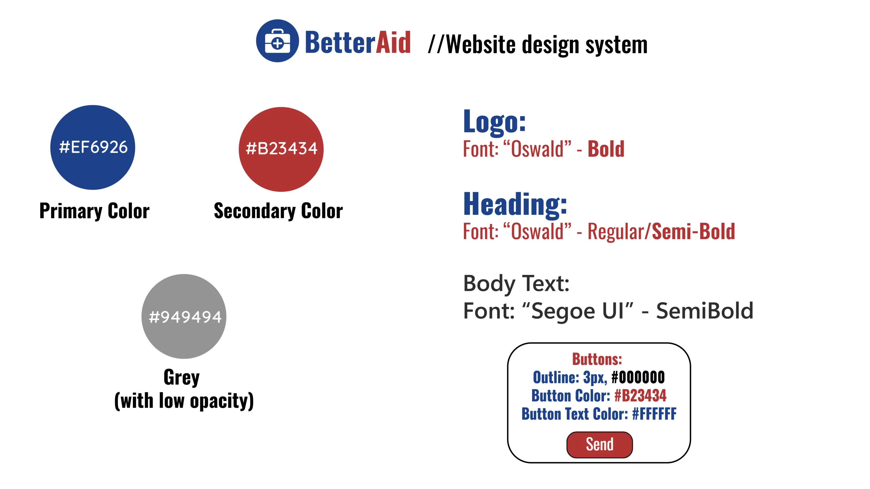
Mockups
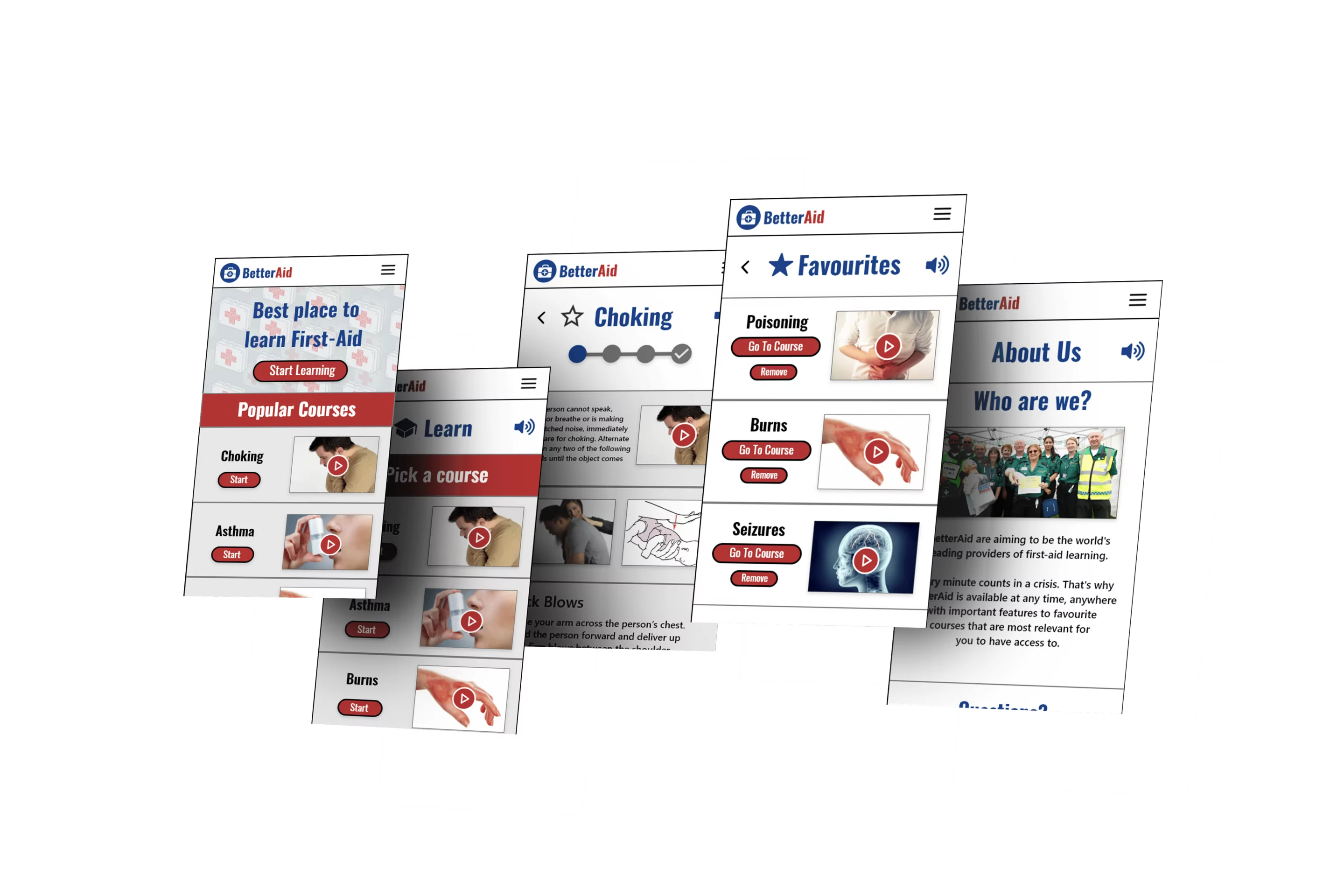
HI-Fi Prototype
(Made with Adobe XD)

Takeaways
Impact
The impact this app would have if it would’ve been made would’ve been very good. User feedback of the final app was mostly that they wanted the app to be real, which is a sign that an app like this one is needed on the market and would benefit the people.
What I Learned
What I learned from this project is how UX can be used for social good. The Accessibility options used in this project is a sign of self-improvement and truly getting to empathize with the user and how that directly benefirs the projects! I can’t wait to see what’s next & how I can improve on my designs!
